With the health care reform bill passed, many are now debating the merits of so-called “Obamacare.” The debate over care vs. cost continues, and many are looking for answers about what the health care reform bill will actually do. These questions are important for consumers, and they are also important for health care administrators. Now is a great time to get involved with health care, possible earning a Masters in Health Administration. With more people able to access health insurance and health services, the entire health industry is getting ready growth.
There are plenty of interesting infographics out there explaining how health care reform is to work, and how Obamacare will work. Some of them aren’t terribly useful (or accurate), but many of them can show you exactly how you will be affected by health care reform. Here are 17 infographics explaining Obamacare and health care reform: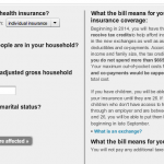
- What does the health-care law mean to me?: This helpful infographic from the Washington Post is pretty low key. It doesn’t have bright colors, but it is interactive and very easy to use. Put in your current health insurance situation, your household size, your adjusted gross income and your marital status. Off to the side, you will see exactly what you can expect from health care reform, including whether or not you will see additional taxes as a result of the passage of this new health insurance law.
 How does health reform work?: American Progress offers this look at what the health care reform bill will do for Americans. It breaks the bill down by coverage, and helps provide some helpful insights into what is actually in the bill. It is a visual representation of what kind of health insurance options you have under Obamacare, as well as showing how the bill will be paid for, according to the authors of the bill and the analysis from the non-partisan Congressional Budget Office.
- Health Care Reform: By The Numbers: The debate over health care reform has been acrimonious, full of accusations and counters. Depending on who you
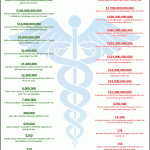 listen to, health care reform does different things — and costs different amounts of money. While the Democrats tout the positives of the bill, conservative think tanks have been running their own numbers, which are different from what the Congressional Budget Office has come up with. Here is an interesting infographic from Third Age that features the claims of both sides. Read it, and decide which side you are more inclined to believe. Or, perhaps, you might think that both sides are exaggerating.
 - Timeline of health care reform: Health care reform has been on the
 docket for nearly 100 years. Indeed, Theodore Roosevelt tried to get us on a national insurance plan way back in the day. He campaigned on it in 1912 when he was running on the Progressive Party ticket. However, Roosevelt didn’t win, and for almost a century numerous attempts to provide coverage for all Americans have been made. The New York Times offers this interesting infographic that puts the recent health care reform bill in a historical perspective that spans decades.
 - Vote on health care reform: If you are interested in knowing how
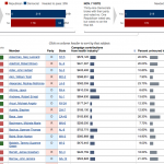 your representatives voted on health care reform, you see how they voted. This infographic from The Washington Post illustrates who voted for health care reform, and compares the votes that were seen in the original vote on November 7th with the votes that were cast on March 21st, after a reconciliation version with the Senate was put forward. The infographic also includes information about health industry contributions and the uninsured in the representatives’ districts.
 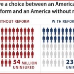 Uninsured without health care reform: This infographic from The Cultural Health News Blog is a simple comparison of the numbers that will remain uninsured with health care reform, and those who would be uninsured without it. While Obamacare won’t mean insurance for everyone, it should, according to most estimates, cut the number of uninsured by somewhere in the neighborhood of half. Whether or not you agree with the bill, it is supposed to help make sure more people have access to health care, and this infographic illustrates that, attempting to show the difference in “before” and “after”.
- New York Post health reform infographic: This was one of the more controversial
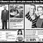 infographics run. It appeared in the New York Post last summer about health care reform, and its incarnation at the time. It personalizes it to New Yorkers, since that’s the audience. It was linked on Drudge, and got some wide publicity. However, it represents some of the numbers from the old bill, before the changes adopted for the final. And it contains some other inaccuracies. But some of the information is accurate, and it is an interesting presentation of what the bill would do to ordinary people.
 - Corrected New York Post infographic: A Democratic aide took issue
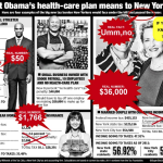 with some of the inaccuracies in the above infographic, and created a corrected version. You can see where the inaccuracies are, and see the real numbers that appeared in the bill. Talking Points Memo shared the corrected version, along with the original, for comparison. As you can see, while there weren’t a ton of corrections, some of the inaccuracies were a bit glaring. It is a helpful look at how sometimes it is important to not take infographics at face value all the time.
 - Health care costs: Back in the summer of 2009, before the current bill was passed, there w
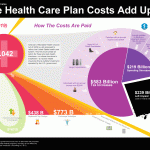 ere some different estimates about costs, and they were largely higher than the current version. The Congressional Budget Office offered a look at costs projected out to 2019. The version of the bill that passed costs less (and is projected to reduce the deficit), but this is still a good infographic that offers helpful information about where the money to pay for health care reform comes from. Visual Economics offers this colorful and fascinating infographic.
 - Savings from health care reform: Some have speculated that some of the savings from health care reform and Obamacare
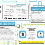 will also come from earlier efforts to include electronic health records in the system. Interested in learning about potential savings from health care reform? This infographic from Good.is offers a look at some of the changes that could be made with the help of health care reform. Estimates include days saved in the hospital, pay for nurses working over time, reductions in the costs of drug dispenstion, and other costs. Looks at places where health care reform, with the help of data driven protocols, can offer savings for everyone.
 - The Healthcare System in the US: EHM offers an interesting and enlightening
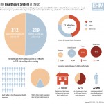 infographic on the health care system in the U.S., and what it has been costing. This offers a look at current health expenditures, and offers insights into what might changes as a result of the health care reform bill that recently passed. This could mean fewer bankruptcies and foreclosures due to medical costs, and help shore up individual finances in general. It offers an interesting look at how health care relates to the rest of the economy.
 - Obamacare flow chart: Back in the autumn, before some changes were made, Fast Company offered an easy to read flow chart of how health care reform would work. It is actually still fairly relevant, showing how
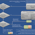 you can trace what health reform will do for your situation by answering a couple of very basic questions about your current health insurance status. It’s a very clear cut flow chart that lays it out fairly simply. It’s really not that complex when you look at this chart. The way it’s set up makes it easy to imagine different scenarios for your health situation.
 - Affording health care: This infographic looks at the need for health care reform by showing how many people have been unable to afford health services, due to the cost. Indeed, since so many
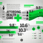 Americans are uninsured, and do not have access to health care they can afford, some do not actually get the care they need. This infographic from the American Principles Project also points out that even some with health insurance can’t afford some of the costs of health care. Avoiding treatment due to cost is something that the authors of the health care reform bill will reduce. However, it remains to be seen whether the bill can actually reduce costs. But it may help some who don’t get care now to get it in the future, since costs are supposed to be lower and more people will be covered.
 - Uninsured Americans: Another infographic designed to correlate
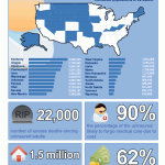 health insurance and high health costs with other economic factors, this infographic from EHM is useful. It looks at the situation according to state, showing how each state fares in terms of health insurance coverage, and looking at how many excess deaths are caused due to a lack of health insurance coverage and access to affordable care. It also includes a statistic on the number of people who have lost their health insurance. This infographic is meant to illustrate some of the things that might be improved with health care reform.
 - Health care spending in the U.S.: This comparison from Kiplinger
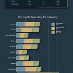 looks at health care spending in the U.S. vs. the spending in other countries. You can see that the U.S. spends significantly more per person than many other countries around the world. One of the aims of the bill is to help close that gap. However, some argue that the gap won’t be closed by this bill. Another concern is that other countries are rated as having better health care than the U.S., even though it costs less per person. It will be interesting to see if that changes as a result of Obamacare.
 - GOP Obamacare infographic: This is a famous and controversial
 infographic created by GOP staffers when the health care reform debate was heating up. It is complicated and difficult to follow, as well as unattractive. It shows a health care system that is convoluted and difficult to navigate and expensive, as well as full of committees, oversight and numerous problems. There was an outcry against this infographic as it went viral, with some blasting it for purposely muddying the waters of debate with deliberate attempt at misinformation.
 - Dems make their own chart: In response to the GOP chart, someone with Democrat leanings created a new chart. This one was derided as
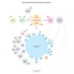 being inaccurate as well (too positive and touchy-feely), along with being mocked a little for the pastel tones that reminded many of sherbet. The information was much easier to follow, but the light colors made it seem a little “weak” in some eyes. It really wasn’t much of an attention getter, with its non-threatening set-up.
Did you enjoy this article?

